Anyone with an internet connection can access the internet, which is a tremendous resource for all kinds of information. However, accessibility is frequently overlooked or ignored by designers and developers.
Making website content accessible means that all users can access with or without assistive technologies. This includes users who have physical or cognitive impairments as well as color blindness, hearing loss, vision impairments, or both. Some of these people access content on the internet using technologies that boost color contrasts or read the text aloud.
Why should I care?
16% of the world population experience significant disability, and the WebAIM Million report examined the home pages of the top 1 million websites and it was discovered that 96.3% of them failed to adhere to the most basic accessibility guidelines.
You can miss out on a lot of potential visitors if your website is inaccessible! In addition, making your website more accessible increases Search Engine Optimisation and user experience for everyone.
Not making a website accessible because it takes too long and not impacting the majority of users, is the same as saying ”it takes too much time to check grammar, spelling, and proof-read a document”. The process of designing and developing a website should include web accessibility as a natural step alongside considerations for performance, style, and responsiveness for mobile devices.
Web accessibility may be somewhat invisible and seems more like an add-on feature, until the legal systemgets involved. Numerous regulations may call for a website to be accessible, and both Netflix and Dominos have been the target of lawsuits.
So what can I do?
Alternative Text
In fact, missing alternative text, also known as alt text for images is one of the biggest accessibility issues.
Alternative text can be a quick and easy way to add accessibility to images.
Alternative text is added on the <img> element, and if the image fails to load, the alt text will be shown instead.
Image found, alt text not showing:

Image not found, alt text is showing:

<img
  src="/img/coffee-cat.jpeg"
  alt="Cute cat wearing a beanie, holding cup of coffee"
/>
Making descriptive alt texts can sometimes be hard when you’re not used to it.
Here are a few tips to writing good alt text:
- Be specific and concise. Describe the content of the image without editorializing.
- Never start with ”Image of …” or ”Picture of …“.
- Keep it short and descriptive, like a tweet.
- Leave alt text blank if the image is purely decorative.
Semantic HTML
HTML already has a lot of descriptive elements that comes with built-in functionality that can save you many lines of Javascript or CSS. So instead of having millions of <div> elements, use the elements that suit the context or functionality.
Using HTML to semantically describe an elements position, function, or context, also greatly improves SEO performance, as well as code readability.
This could be as simple as using the <header> and <footer> elements to properly describe where the content is located on the page.
The <details> element for dropdown accordions:
Example
HyperText Markup Language
HTML is the standard markup language for documents designed to be displayed in a web browser.
It is often assisted by technologies such as Cascading Style Sheets (CSS) and scripting languages such as JavaScript.
<details>
  <summary>HyperText Markup Language</summary>
  <p>
    HTML is the standard markup language for documents designed to be displayed
    in a web browser.
  </p>
  <p>
    It is often assisted by technologies such as Cascading Style Sheets (CSS)
    and scripting languages such as JavaScript.
  </p>
</details>
The <output> element is a container element into which a site or app can inject the results of a calculation or the outcome of a user action:
Example
<form oninput="result.value=parseInt(a.value)+parseInt(b.value)">
  <input type="range" id="b" name="b" value="50" /> +
  <input type="number" id="a" name="a" value="10" /> =<output
    name="result"
    for="a b"
  >
    60
  </output>
</form>
or more descriptive elements like <address> and <time>.
Color Contrast
Good color contrast is critical for web accessibility. It helps make content more readable and usable for everyone, including people with low vision or color blindness. By comparing the foreground and background colors e.g. background color and text color, it’s possible to measure the color contrast ratio and test if it lives up to the requirements.
To ensure good color contrast, accessibility guidelines recommend a minimum contrast ratio of 4.5:1 for normal text, although the ratio may vary depending on text size and weight. Tools are available to check color contrast and ensure that it meets the required standards.
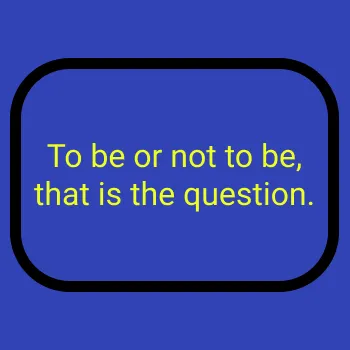
High contrast - contrast ratio 7.26

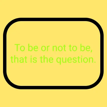
Low contrast - contrast ratio 1.00

Most browsers come with a built-in contrast checking tool. In Chrome and Firefox you can find it by opening the developer tools (Ctrl + Shift + i), and click the element inspector at the top (Ctrl + Shift + C). Now you can hover the cursor anywhere on any website and see the contrast ratio.
If you are trying to pick a color and wish to see the contrast, I like to use Colour Contrast Checker.
Tabbing
Tabbing means being able to select clickable elements like links and buttons on a website by using the Tab-key. Tabbing is crucial for keyboard accessibility on websites, especially for people with disabilities. It enables efficient navigation for keyboard-only users.
This is easy to test yourself, as you can go to any website and press tab through the website yourself. You’ll quickly notice if there are elements that are meant to be clicked, but doesn’t get selected.

You can make any element focusable by adding a tabindex=0 attribute value to it. That will add the element to the list of elements that can be focused. However, if you use HTML semantically, you will rarely have to use this, as <a> and <button> are already focusable.
<div class="special-button" tabindex="0">This element is focusable</div>
<div class="special-button">This element is not focusable</div>
If you have tabbed through a website or two, you quickly find out how tedious it is to tab through
To Top ↑